Have you ever wondered why some websites whizz past others while some only play catch up? One major reason for this is that the Whizzers always keep evolving with the ever-changing Google updates. This brings us to Google’s mobile-first indexing. In this article, we’ll talk about what is mobile first indexing, when it’s going to be rolled out by Google, and how you can optimize your website to make the most out of it.
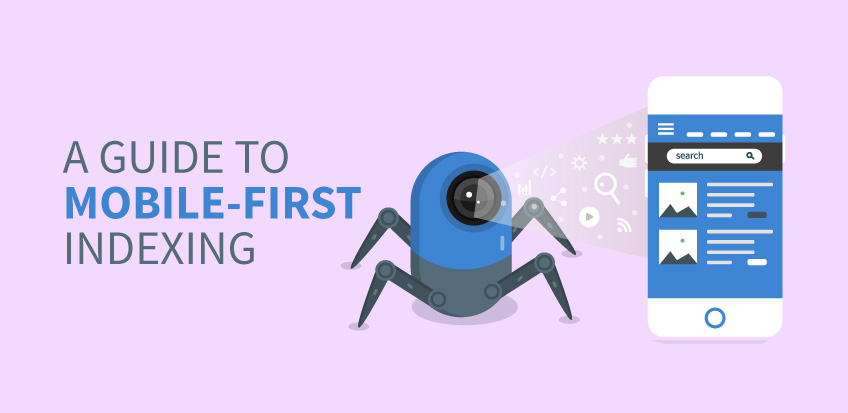
What is Mobile-First Indexing?
Whether you are a newbie or have loads of experience with SEO, you must have heard about this update, which is creating a significant shift in site rankings. And it isn’t something new; Google was always signaling that user browsing behavior is switching to mobile. This causes the search engine giant to roll out “mobile-first indexing’: a new way to crawl and index websites to foster user experience. What this essentially means is that the crawlers will get all the information about your website from the mobile version and then rank accordingly. So, it all boils down to how much content and resources your mobile website has in order for you to rank better.
Initially, Google announced that in September 2020, it would port all the websites over to the mobile-first index. However, that decision has now been put on the back burner due to 2020’s greatest villain, Covid-19. The latest date declared by the search engine giant is March 2021.
But, what does this mean for your website ranking? Is it something to be worried for? What should you do?
There’s no need to panic. We’ve narrowed down everything that you need to do to make your site mobile-first indexing compliant.
Best Practices of Mobile-First Indexing
Now that you know what mobile indexing is, its purpose, and its function, let’s discuss the best practices regarding it. If you want to make your website mobile-friendly and ensure that your website is optimized for Google’s ranking and mobile-first indexing methods, the following tips will definitely be useful for you:
1. Check if Google Bots Can Access and Render Your Mobile Website
You can do three things to make sure Googlebots have accessibility to all the things they need on your website’s mobile version:
Keep Meta Robots Tags the Same As On the Desktop Website

Meta robots are your best buddies when it comes to Google’s ranking. If you don’t use the same meta robots tags as you do on the website’s desktop version, Google will less likely be able to crawl and index your site.
Allow Googlebot To Crawl Your Website’s Resources:
If the mobile version of your website has different URLs than the desktop one, make sure you do not block them with a disallow directive.
Make sure You Don’t Use Lazy Loading for Primary Content.
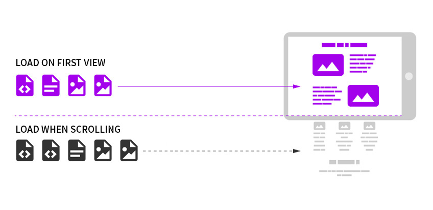
What this means is deferring the load time of non-critical or non-visible content on your website (especially images or videos). This is more recommended and common for the desktop version. For mobile, be sure not to lazy-load content that needs user interaction, such as clicks, swipes, etc., since Google will not trigger these interactions.
2. Provide the Same Experience on Mobile and Desktop
Does your website’s mobile version have less primary content than your desktop site? Some publishers do that very often. Little do they know that this affects their chances to get Google’s spiders to crawl and index their mobile site. Dang! Who wants that?
According to Google, if mobile is the future, why should your mobile visitors get any less website experience? To this end, Google encourages website publishers to provide the same experience on both desktop and mobile versions.
I’m wondering what that means exactly.
We made it super simple for you and narrowed down the key factors you need to consider.
Here are five essential factors that you should keep consistent across both versions of your site:
- Metadata
- Website content, which includes H tags, etc.
- Structured website data
- Image alt text
- Error page status
Remember, once Google decides to prioritize your mobile site for indexing, it will not use the desktop site at all. If you have less content on the mobile version, don’t be surprised if you start seeing drop in traffic.
3. Listen to Google Recommendations
Google is super transparent when it comes to the major indexing tasks that every website needs to carry out. It has published great guidelines, which include a list of mobile-first indexing best practices as well. Here they are for you below:
- Use high-quality images on your mobile website.
- There must not be any ad that creates a bad user experience.
- Make sure Google can see your lazy-loaded content.
- Use only supported formats for videos and images.
- Avoid using the image and video URLs that change each time the page loads.
- Make sure the videos are easy to spot and view on your mobile website.
- Avoid using fragment URLs or subdomains on your mobile site.
- Test your desktop and mobile websites in the Search Console.
- Ensure that your URL hreflang annotations point to the mobile variant of your country and language version.
- Make your mobile site able to handle an increased crawl rate.
- If you are using separate URLs for the mobile site, ensure they are used consistently within your structured data.
4. Work on the Responsiveness of Your Website

Responsiveness is key when it comes to a great user experience. A responsive site is quick to adjust its elements according to users’ screen sizes. The user always gets to see a fully optimized version of the site, whether they access it from a mobile phone, tablet, or laptop. Most importantly, webmasters don’t have to create different versions of their websites to meet every device’s standards due to this feature.
If your site already has a responsive design, mobile-first indexing should not have a meaningful impact on its SERP performance. According to Google, websites with reasonable response rates and correct use of dynamic serving don’t have to make any changes to make their site mobile-first indexing compliant.
Thus, responsive web design is a handy and versatile option to kill the need to create different versions for both mobile and desktop sites.
5. Have Mobile-Friendly Content
Reading from a desktop screen is hard, and reading from a mobile screen is even harder. To attract and retain mobile surfers, you will need to have a mobile-friendly web copy. This means short sentences and paragraphs; fonts should be large and clear enough and use enough whitespace.
How do you check if your website is Mobile-first?
There are many tools that can help you. A lot of these tools will tell you about what’s wrong with the mobile version of the site. It can related to the speed, layout, or user experience. The quickest and most reliable way to find out is by checking your site using Google’s Page Speed Insights Tool. You’ll get different scores for both the desktop and your mobile version, as well as a list of areas to fix with certain suggestions from Google.
A Mobile Future
Times have changed, and those who don’t keep up with it usually lag behind. Now, users are more likely than ever to browse the internet by tapping on their mobile. So Google’s decision to roll out mobile-first indexing is simply a quick response to this change in user behavior. If your website isn’t optimized for both desktop and mobile users, now is the right time to do it.